Enterprise Figma to Code: Built for Compliance, Accessibility & Scale
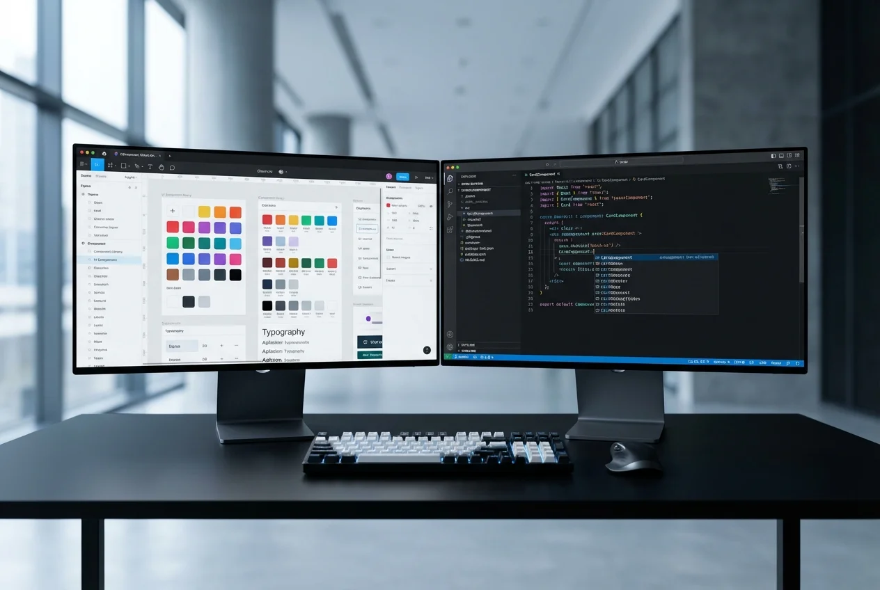
Converting Figma designs into production code is not inherently difficult. Converting them into production code that satisfies enterprise accessibility requirements, passes security reviews, integrates with corporate CI/CD pipelines, and scales across a design system with hundreds of components — that is a fundamentally different challenge. It is the challenge we specialise in.
Most Figma-to-code providers optimise for speed. They produce visually accurate components quickly and move on. For startups and marketing sites, that approach works. For enterprise organisations operating under WCAG 2.1 AA obligations, PSBAR (Public Sector Bodies Accessibility Regulations), or EN 301 549 compliance requirements, it is insufficient. The visual layer is only one dimension of a compliant, production-grade frontend.
Accessibility as a First-Class Requirement
Every component we build from your Figma designs undergoes rigorous accessibility engineering:
- Semantic HTML structure: Correct heading hierarchies, landmark regions, and element roles — ensuring assistive technologies can parse your interface meaningfully, not just visually.
- Keyboard navigation: Full keyboard operability including focus management, tab ordering, skip links, and keyboard-accessible interactive elements. Every modal, dropdown, and custom control is operable without a mouse.
- ARIA implementation: Proper aria-label, aria-describedby, aria-live, and role attributes applied where semantic HTML alone is insufficient. We follow WAI-ARIA Authoring Practices for all custom widgets.
- Colour contrast verification: Automated and manual contrast ratio checking against WCAG AA thresholds (4.5:1 for normal text, 3:1 for large text). We flag design-level contrast issues before development begins.
- Screen reader testing: Components tested with NVDA, JAWS, and VoiceOver to verify real-world assistive technology compatibility — not just theoretical ARIA compliance.
- Reduced motion support: All animations respect the prefers-reduced-motion media query. Users who require reduced motion receive a fully functional experience without animation.
Security-Conscious Frontend Development
Enterprise frontends handle sensitive data, interact with authenticated APIs, and operate within corporate security perimeters. Our development practices reflect this:
- Content Security Policy compliance: Components built to work within strict CSP headers — no inline styles where CSP prohibits them, no eval-based patterns, no external resource dependencies without explicit approval.
- XSS prevention: All dynamic content rendering follows secure patterns. User-generated content is sanitised. DOM manipulation avoids innerHTML in favour of safe React patterns.
- Dependency auditing: Every npm package in the component library is audited for known vulnerabilities before inclusion. We maintain a dependency whitelist for enterprise clients with strict supply chain requirements.
- Secure authentication UI patterns: Login forms, MFA flows, and session management interfaces follow OWASP frontend security guidelines — including protection against credential stuffing, phishing indicators, and session fixation.
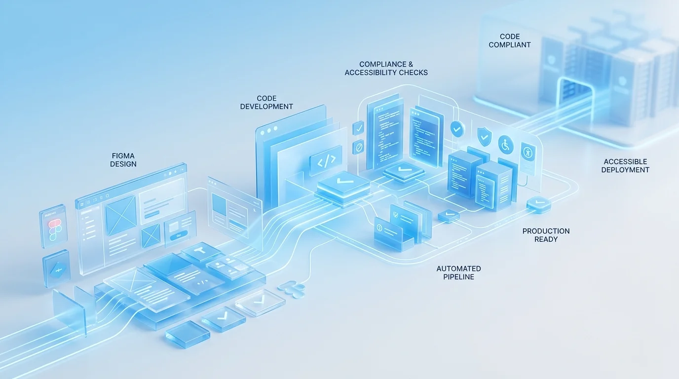
Large-Scale Design System Implementation
Enterprise design systems are not small. A typical enterprise Figma library contains 100 to 500 components across multiple categories — primitives, composites, patterns, and page templates. Converting this at scale requires systematic methodology, not just skilled developers:
- Token architecture: Enterprise tokens often span multiple themes (light/dark/high-contrast), multiple brands (sub-brands, white-label variants), and multiple platforms. We implement token systems that handle this complexity with CSS custom properties, Tailwind theme extensions, or design token tooling like Style Dictionary.
- Component governance: Each component receives a defined API surface, versioning strategy, deprecation policy, and ownership assignment. This is critical for organisations where multiple teams consume the component library.
- Cross-team collaboration: We integrate with your existing workflows — pull request reviews in GitHub or Azure DevOps, design review sessions with your design team, and architecture discussions with your platform engineering group.
Enterprise Toolchain Integration
We do not deliver components in isolation. They integrate with your existing engineering infrastructure:
- CI/CD pipelines: Components include automated test suites that run in Azure DevOps, Jenkins, or GitHub Actions. Visual regression tests, accessibility audits (axe-core), unit tests, and bundle size checks all gate the deployment pipeline.
- Storybook with Chromatic: Enterprise Storybook deployment with visual regression tracking, component documentation, and design review workflows that connect your design and engineering teams.
- Package registry: Components published to your private npm registry (Artifactory, GitHub Packages, or Azure Artifacts) with semantic versioning and automated changelogs.
- Monitoring integration: Frontend error tracking (Sentry, Datadog RUM) and performance monitoring configured for each component, with alerting thresholds aligned to your SLAs.
Documentation & Compliance Artefacts
Enterprise projects require documentation beyond code comments. We deliver:
- Accessibility conformance reports (VPAT/ACR format) for each component
- Security review documentation covering dependency audit results and secure coding practices
- Component API documentation with usage guidelines, dos and don'ts, and migration guides
- Architecture decision records (ADRs) for significant technical choices
- Test coverage reports and quality metrics dashboards
If your organisation needs Figma designs converted to production code that meets enterprise compliance, accessibility, and governance standards, book a free consultation. We will review your design system and provide a detailed assessment of scope, timeline, and compliance requirements.


 Enterprise Bespoke Development
 Regulated Industry Web Applications
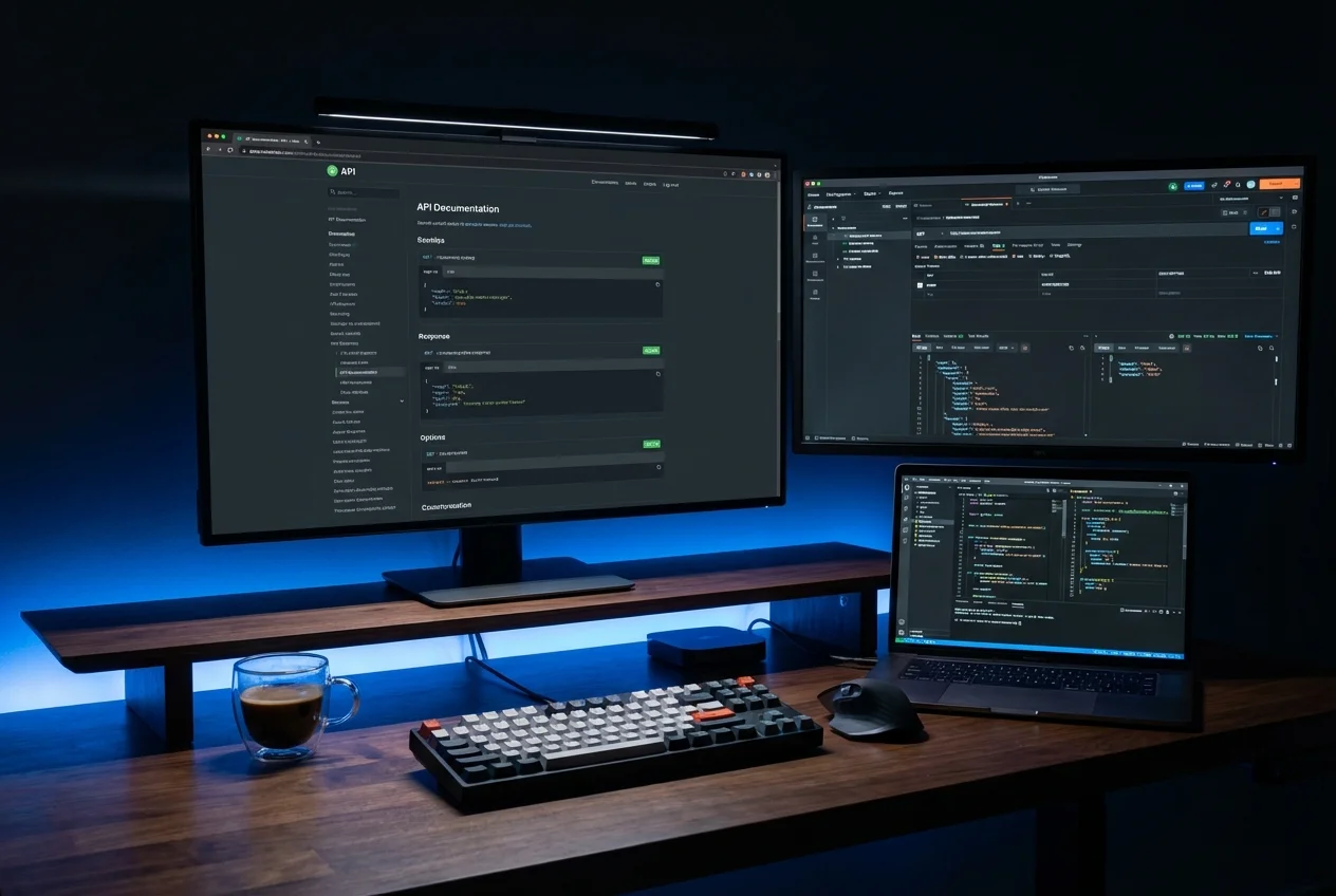 Enterprise System Integration
 Enterprise Mobile Applications
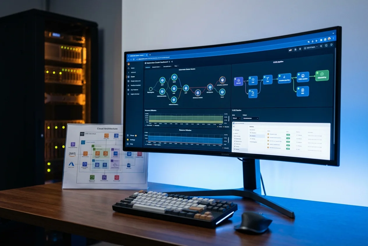 Azure Enterprise Infrastructure
 Enterprise Modernisation Advisory