Figma Enterprise Accessibility & Inclusive Design Guide
Enterprise Figma to Code Is a Different Discipline
When a startup converts Figma designs to React components, the primary concern is visual fidelity and shipping speed. When an enterprise does it, the concerns multiply dramatically: accessibility compliance under WCAG 2.1 AA (and increasingly AAA for specific components), security governance, integration with corporate CI/CD infrastructure, cross-team component ownership, and auditability. The technical skills required are similar. The process, governance, and quality assurance requirements are fundamentally different.
We have delivered Figma-to-code projects for organisations ranging from 50-person growth companies to FTSE 250 enterprises. The difference in what "done" means between those two contexts is enormous, and most agencies underestimate it. This article describes what enterprise-grade Figma-to-code actually involves — and why the processes that work for startups create risk at enterprise scale.
Accessibility Is Not an Add-On
For enterprises operating in the UK, WCAG 2.1 AA compliance is not optional. The Equality Act 2010 requires reasonable adjustments for disabled users, and the Public Sector Bodies Accessibility Regulations (PSBAR) impose specific technical standards on public sector organisations. Private sector companies serving EU customers face EN 301 549 requirements. Non-compliance creates legal risk, reputational risk, and exclusion of users who depend on assistive technology.
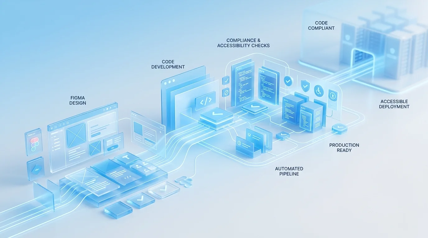
In enterprise Figma-to-code work, accessibility engineering begins during the design audit — before a single line of code is written. We review Figma files for colour contrast ratios, heading hierarchy, touch target sizes, and interaction patterns that may present barriers to keyboard or screen reader users. Issues identified at this stage are flagged to the design team for resolution before development begins, because fixing accessibility in design is dramatically cheaper than fixing it in code.
During development, every component undergoes:
- Semantic HTML review — correct elements for correct purposes, landmark regions, heading hierarchies
- Keyboard operability testing — tab order, focus indicators, keyboard-accessible custom controls
- ARIA implementation where semantic HTML is insufficient — following WAI-ARIA Authoring Practices precisely
- Automated axe-core scanning integrated into the CI pipeline — accessibility regressions block deployment
- Manual assistive technology testing with NVDA, JAWS, and VoiceOver on actual content
The output includes accessibility conformance reports in VPAT/ACR format — the documentation procurement teams and legal departments need to demonstrate compliance.
Security Reviews and Governance
Enterprise frontends operate within security perimeters that startup projects never encounter. Content Security Policy headers restrict inline styles and scripts. Dependency supply chain policies limit which npm packages can be used. Data handling requirements dictate how user input is processed, validated, and transmitted.
Our enterprise development process includes a security review phase where we document the component library's dependency tree, audit each package for known vulnerabilities, verify CSP compliance, and ensure all dynamic content rendering follows secure patterns. For clients in financial services or healthcare, we provide documentation that their InfoSec teams can review as part of the change approval process.
This is not security theatre. We have worked on projects where a single npm dependency with a known XSS vulnerability would have blocked deployment for weeks while the security team assessed the risk. Proactive dependency management avoids these delays entirely.
Large-Scale Design System Conversion
Enterprise design systems are measured in hundreds of components. A typical enterprise Figma library might contain 150 to 400 components spanning primitives (buttons, inputs, typography), composites (cards, modals, navigation), patterns (forms, search, data tables), and page templates. Converting this volume requires systematic methodology:
Phase 1 — Token layer: All design tokens extracted and implemented as CSS custom properties or Tailwind theme extensions. Multi-theme support (light, dark, high-contrast) configured from the start. Token naming conventions aligned with the Figma structure so designers and developers share a common vocabulary.
Phase 2 — Primitives: Atomic components built with full variant support, comprehensive state handling, and accessibility baked in. Each primitive undergoes individual QA before composites are built on top of it.
Phase 3 — Composites and patterns: Higher-order components composed from primitives. This phase tests the architecture — if the token and primitive layers are well-built, composites come together efficiently. If not, issues surface here and are corrected.
Phase 4 — Governance setup: Component versioning strategy, deprecation policy, contribution guidelines, and ownership assignments. For organisations where multiple teams consume the component library, this governance layer is as important as the components themselves.
Cross-Team Handoff Protocols
In enterprise organisations, the team that commissions a component library is rarely the only team that uses it. Product teams, platform teams, and external agency partners all consume shared components. Effective handoff means more than documentation — it means establishing processes for requesting changes, reporting bugs, contributing components, and managing breaking changes across consuming teams.
We establish these protocols as part of the delivery, not as an afterthought. The goal is a component library that functions as shared infrastructure, not as a one-team deliverable that other teams happen to use.
If your organisation needs Figma designs converted to production code that meets enterprise compliance, accessibility, and governance standards, book a free consultation. We will review your requirements and provide a realistic assessment of what the project involves.
 Enterprise Bespoke Development
 Regulated Industry Web Applications
 Enterprise System Integration